MakeMyTrip

MakeMyTrip

MakeMyTrip

MakeMyTrip

B2C Mobile App UX of #1 Travel Company in India

B2C Mobile App UX of #1 Travel Company in India

B2C Mobile App UX of #1 Travel Company in India

2018

2018

2018

MakeMyTrip is an online travel company that helps customers book travel services, including flights, hotels, holiday packages, and more. It is a tech-driven platform designed to simplify and enhance the process of tipping service staff. Leveraging digital payment solutions, MakeMyTip enables seamless and cashless tipping through a mobile application, offering users convenience and security.

MakeMyTrip is an online travel company that helps customers book travel services, including flights, hotels, holiday packages, and more. It is a tech-driven platform designed to simplify and enhance the process of tipping service staff. Leveraging digital payment solutions, MakeMyTip enables seamless and cashless tipping through a mobile application, offering users convenience and security.

Products

Web & Mobile Apps

Website

What I did?

UX Audit

User Research

What I did?

UI Design

Documentation

Who I worked with?

Design Manager

Product Managers

What I did?

Content Team

UX Researchers

Project

Project

Project

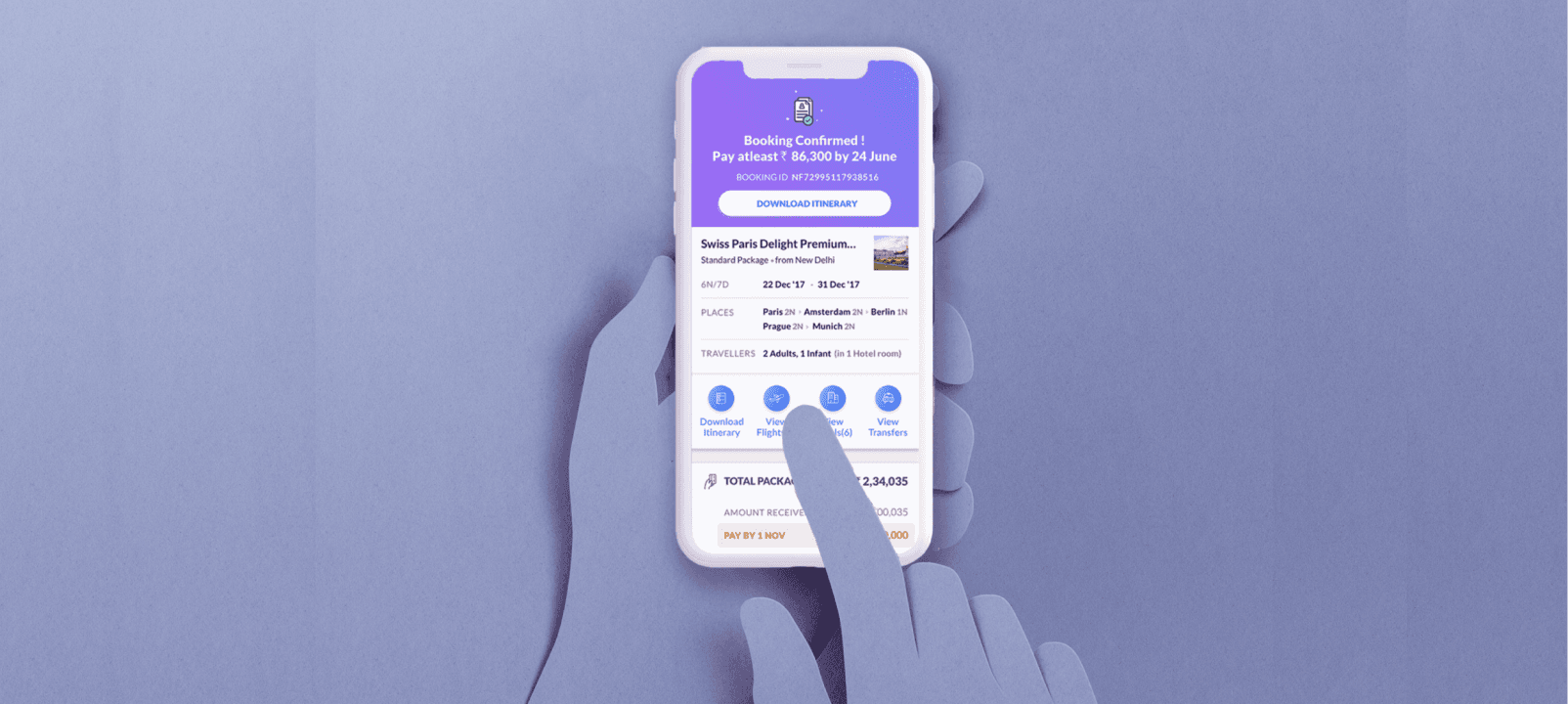
To design an interface which improves the post-sale customer experience. After a customer books a holiday package there is a lot of information that needs to be conveyed by the travel agency to the customer. The objective is to create a user-friendly experience which serves as a virtual travel guide and keeps the user updated about all the necessary details.

To design an interface which improves the post-sale customer experience. After a customer books a holiday package there is a lot of information that needs to be conveyed by the travel agency to the customer. The objective is to create a user-friendly experience which serves as a virtual travel guide and keeps the user updated about all the necessary details.

Understanding the Problem

Understanding the Problem

Understanding the Problem

Before design revamp, customers get a confirmation email with all the information of the holiday package. Problems that users facing with it -

Information Overload

Information Overload

Text Heavy Interface

Text Heavy Interface

No Live Updates On Bookings

No Live Updates

No Live Updates On Bookings

Lack of Delight Factor

Lack of Delight Factor

Many emails to track

Many emails to track

Keeping user emotions in mind which can range from anxiety to enthusiasm, a booking confirmation mail might not be enough. There is a constant need for information, given they’ve just invested a significant amount of money.

Facts & Figures

Facts & Figures

Facts & Figures

Data for user research was acquired from call centres of the company. It is observed that majority of the queries were regarding basic information i.e., tickets & package details.

Others included queries for transfers, sightseeing information, hotel accommodation and cancellations/refunds.

Inputs from Stakeholders

Inputs from Stakeholders

Inputs from Stakeholders

Over multiple discussions, insights were taken from various teams involved in developing the product. Feasibility, execution, logistics and available human capital played a huge role in shaping the product

Diverging on possibilities

Diverging on possibilities

Diverging on possibilities

Brainstorming sessions were mainly surrounded around one main idea—what does a traveller need before going on their holiday trip and during the trip. Keeping in mind that the requirements differ from one customer to another and also differ from package to package, it was very important to design an interface that could accommodate all such differences.

Each type of the dots represents user queries and the frequency of calls received at the call centre during the waiting period. It can be observed that the density of calls are comparatively high just after the customer books a holiday trip and just before day of departure. In conclusion, the interface had to possess definitive qualities, one being aware of the timeline, should be able to satisfy the itch of the user to know more and keep the user informed at all times and should be able to set the right expectations for their upcoming holiday.

In spite of all differences, the one element which was common to all was the timeline i.e., the time period between the two events - when customer books and the day of departure. It is observed that the behaviour of the customers can be generalized during this period.

Each type of the dots represents user queries and the frequency of calls received at the call centre during the waiting period. It can be observed that the density of calls are comparatively high just after the customer books a holiday trip and just before day of departure. In conclusion, the interface had to possess definitive qualities, one being aware of the timeline, should be able to satisfy the itch of the user to know more and keep the user informed at all times and should be able to set the right expectations for their upcoming holiday.

Approach to solution

Approach to solution

Approach to solution

Brainstorming sessions were mainly surrounded around one main idea—what does a traveller need before going on their holiday trip and during the trip. Keeping in mind that the requirements differ from one customer to another and also differ from package to package, it was very important to design an interface that could accommodate all such differences.

Each type of the dots represents user queries and the frequency of calls received at the call centre during the waiting period. It can be observed that the density of calls are comparatively high just after the customer books a holiday trip and just before day of departure. In conclusion, the interface had to possess definitive qualities, one being aware of the timeline, should be able to satisfy the itch of the user to know more and keep the user informed at all times and should be able to set the right expectations for their upcoming holiday.

Smart

Anticipates user requirements based on the timeline and prioritizes its contents accordingly

Intuitive

Information is categorized into relevant sections which are easily accessible and is surfaced in layers according to importance.

Simple & Intuitive

Navigation of the main page is kept simple. Designated cards for classifying travel details and a scope to provide continuous updates.

Has a holiday vibe

Vibrant pictures and colorful gradients are used to keep the users excited, allowing them to catch a glimpse of their upcoming holiday, while also maintaining design consistency within the app.

Acts as a tour guide

Itinerary is designed to be interactive and instructive, rather than being text heavy, users can now clearly view their daily activities and also review, ask for help. Hence it acts as a handy virtual tour guide.

Paper Wireframes

Paper Wireframes

Paper Wireframes

Exploration was done using the drawing, allowing me to get on overview of the interface design, while also keeping in line with the existing design system guidelines.

Interface Design

Interface Design

Interface Design

Marvelous Ms Designer